A food brand should make you feel something before the first bite. It should also help you make a decision quickly, trust what happens next and know exactly where you are.
That is the thinking behind the new Terrachow identity, now live across our website, web store and mobile app.
This is more than a fresh coat of colour. We rebuilt the visual language around the experience we want Terrachow to deliver: confident, clear, professional and just funky enough to make ordering food feel less ordinary.
One Terrachow, wherever you meet us
Terrachow lives in several places. The website tells our story. The web store helps you find restaurants and order without downloading an app. The mobile app is where customers discover food, choose how they want it delivered, track orders, earn rewards and return for the next meal.
Those surfaces have different jobs, but they should feel like one brand.
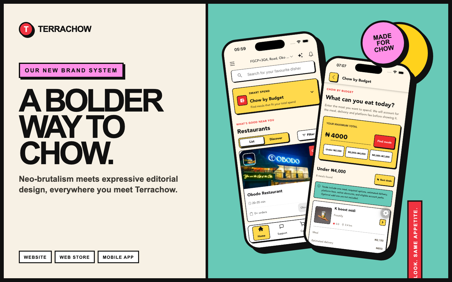
The new system gives each product the same visual DNA: warm cream canvases, strong black outlines, hard shadows, bold typography and a focused palette of yellow, red, teal and pink. You can move from a Terrachow story to a restaurant page to Chow by Budget and still feel completely at home.
What do we call the style?
The short answer is neo-brutalism meets expressive editorial design.
Neo-brutalism gives the system its structure. You see it in the visible borders, solid shapes, direct labels and shadows that make controls feel tactile. There is very little visual ambiguity. A button looks ready to press. A card looks like a card. An important choice is difficult to miss.
Expressive editorial design gives the brand its voice. It brings oversized headlines, deliberate pacing, confident blocks of colour and layouts that feel composed instead of assembled from a generic template.
Put them together and you get a visual language that is playful without becoming childish, and bold without sacrificing usefulness.
Neo-brutalism gives it structure. Expressive editorial design gives it voice.
Why this feels right for food delivery
Food is emotional. Delivery is operational. Terrachow has to do both well.
The expressive side of the identity brings appetite, energy and personality. The structured side makes prices, delivery choices, restaurant status, rewards and actions easier to understand. One part gets your attention. The other earns your trust.
That balance matters in a product where customers are often hungry, in a hurry and comparing several options at once. The interface should never make them work harder than necessary.
A system, not a skin
The redesign is built from repeatable decisions rather than decoration added screen by screen.
- Cream creates a warm, food-friendly canvas that is easier on the eyes than sterile white.
- Black provides strong hierarchy, high contrast and a clear frame for every interaction.
- Yellow marks value, selection, rewards and moments that deserve attention.
- Red carries action, urgency and the unmistakable energy of Terrachow.
- Teal supports helpful information, savings and calmer moments in the journey.
- Pink gives discovery and personality a playful edge.
- Bold display type makes the message immediate, while simpler body text keeps details readable.
- Hard shadows and outlined controls make digital actions feel tangible and memorable.
The system also includes rules for motion, illustration, photography, spacing and dark mode. That keeps the brand recognisable even when the content, feature or device changes.
From the website to the web store
On the marketing website, the system gives our story more confidence. Batch Delivery, customer reviews, our partner offer and the Terrachow story now have clearer rhythm and stronger visual moments. The page can be informative without feeling corporate or predictable.
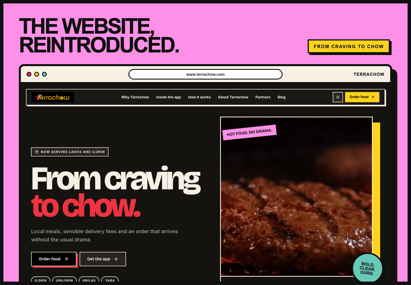
On the web store, the same language becomes more functional. Location selection, restaurant discovery, menu browsing and checkout need clarity above everything else. The bold outlines and colour cues make those steps easier to scan while preserving the personality customers saw on the main website.
The result is a smoother handoff between learning about Terrachow and actually ordering food.
The brand, in your hand
The most important test was the mobile app. This is where the identity has to work repeatedly, not just make a strong first impression.
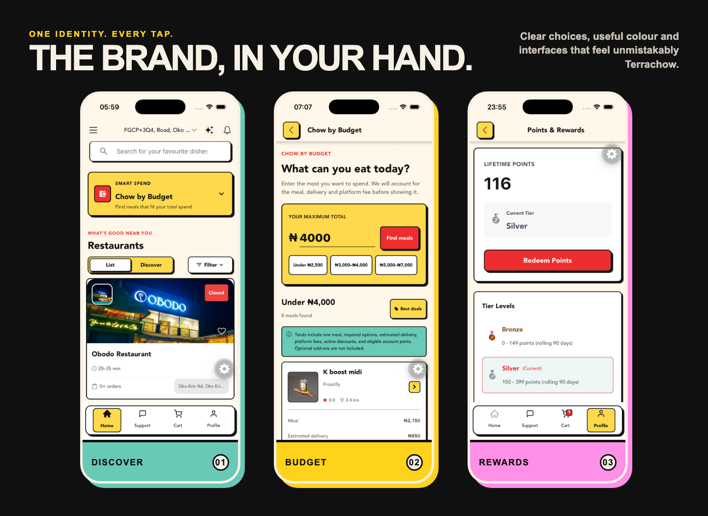
The restaurant experience uses clear cards and status labels to make browsing faster. Chow by Budget turns a spending limit into an obvious, useful starting point. Points & Rewards gives progress and redemption the visual importance they deserve.
These screens share a personality, but they are not identical. Colour changes according to purpose. Cards grow or simplify according to content. The interface remains flexible while the underlying rules stay consistent.
A new look, with room for the familiar
The new system is a choice, not a lock-in. In the mobile app, users can switch to Classic Theme if they prefer the familiar Terrachow interface.
Classic Theme is about comfort, not fewer features. Customers can still discover restaurants, order food, track deliveries, manage rewards and use the same Terrachow services. The theme switch simply gives each person more control over how the app looks and feels.
We believe a new identity should invite people forward without forcing them to relearn a product overnight. Customers who love the bolder experience can use it across the app, while those who prefer the original presentation can keep things classic.
Familiar features, brought forward
The new identity also gives us a better way to explain what makes Terrachow useful.
Chow by Budget helps customers answer a very Nigerian, very practical question: “What can I eat with the amount I have?” The result includes the meal, estimated delivery and platform fees, so the choice starts with the total that matters.
Points & Rewards makes loyalty visible. Customers can see progress, understand tiers and redeem value without digging through hidden menus.
Batch Delivery can now be explained as a clear choice: wait for a shared route and save, or choose faster delivery when speed matters more. The product stays flexible because different meals and different moments call for different decisions.
Bold does not mean noisy
A neo-brutalist interface can easily become overwhelming if every element shouts at once. Restraint is part of the system.
We use bright colour to create hierarchy, not to fill every available space. Large touch targets, plain labels and high contrast support accessibility. Important information remains readable. Motion helps explain events and provide feedback rather than adding distraction.
That is also why the system works in dark mode. The character stays intact, but surfaces and text adapt so the experience remains comfortable and clear.
Not a redesign for redesign’s sake
The goal was never to follow a visual trend. The goal was to become more recognisable, more coherent and easier to trust.
When a customer moves between the website, web store and app, every familiar visual decision reduces friction. When someone sees a social post, an order update or a future delivery bag, the same system can make the source instantly recognisable.
When you see a Terrachow screen, post, order update or delivery bag, it should feel unmistakably ours.
What has not changed
Our purpose is still simple: help people find good food, make smarter delivery choices and spend less effort getting a meal from a restaurant to their door.
The new brand does not replace that promise. It gives the promise a clearer face.
What comes next
This identity is a foundation. You will see it continue across customer communication, rider and restaurant tools, campaigns, social content, packaging, motion and the smaller moments that make a service feel cared for.
For now, explore the new experience, try Chow by Budget and tell us what you think.
Order on the Terrachow web store or download Terrachow on the App Store.
New look. Same appetite. A bolder way to chow.